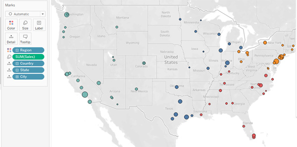
Using Tableau Desktop, you can create Visualizations from information stored in your spreadsheets and databases, giving you the ability to quickly perform data analysis with dynamic and great looking Dashboards.
Using Maps in Tableau allows you to perform geographic analysis by plotting data points on a Map. You can accentuate geographic elements to enable easier data analysis. Maps are good for illustrating geographic trends, comparisons and relationships, and allowing users to drill down for more information.
There are five types of maps you can build in Tableau:
- Proportional Symbol Maps – showing quantitative information for locations
- Choropleth Maps – filled maps useful in showing ratios for comparison
- Point Distribution Maps – plotting points on a map to highlight data points visually
- Flow Maps – tracking the path of something over time across a map
- Spider Maps – tracking where origin location and destination locations interact
Learn how to map data geographically:

Open Tableau document with sales data containing Sales, City, State, Region fields…
- On the Tableau toolbar, select the New Worksheet button
- On the new worksheet tab, in the Data pane, under Dimensions, double-click City.
- In the Data pane, under Dimensions, select and drag Region to the Color box in the Marks
- Observe the regions grouped by color.
Add the sales amount to the map.
- In the Data pane, under Measures, select and drag Sales to the Size box in the Marks
- Observe the regions grouped by color. Notice that the cities overlap each other and you can’t differentiate them all.
- In the Marks card, select Color.
- In the Color menu, in the Border drop-down list, select black or another dark color.
- Observe that the different cities can now be seen more easily with the borders.
- Hover the mouse over different cities to view more detail.
Interested in Mapping? Come to a Tableau class at Full Circle Computing to learn all about them!!
